Introduction
It's been a long time since starting off originally in 2019 with the name Zain Tech Enterprises. Eventually as the organisation changed, we needed to rebrand. Myself and the team members scrambled
to find a new name for both our product brand, and also a core brand we wanted to pool all of our ventures under. Soon enough, we got the name Ahmesen - short for the Ahmed & Jansen Company.
And thus, Ahmesen Inc. was incorporated in September of 2023.
The first thing we needed was new branding. I easily saw a simple, yet elegant oppertunity for a logo here and quickly made the initial design for the Ahmesen logo.
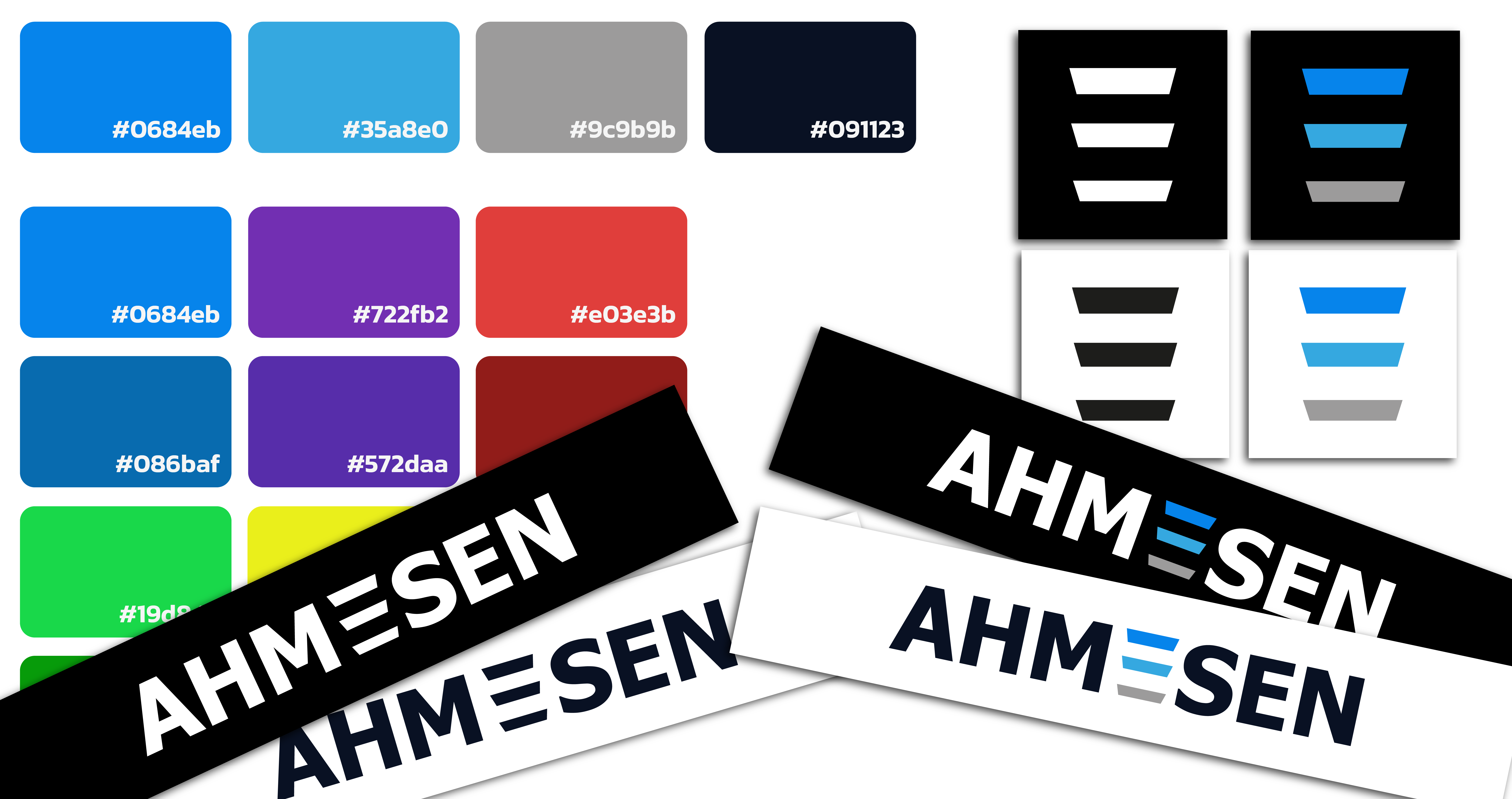
The Design
The Design is pretty simple, just the text saying AHMESEN, and then replacing the centremost E with 3 lines. The goal was to elicit thoughts of a stable and well-run corporation, rather than something cheery or playful. The sharp corners on the 3 stripes represent our attention to details and the colour blue evokes a sense of reliability and trust.
Current Version
Although the design has remained consistent ever since, the colours were recently changed in June 2024, with a more vibrant, yet solidifying new blue added, with the original blue being moved to the centre. This allows us to have greater flexibility with any graphics or other materials that we desire to create, rather than being stuck with odd and hastily picked shades of blue. The grey, however, remains as it represents the solid strong foundations that Ahmesen runs off of.